How to Create a Design That Lives in Space
When you think of space, the first thing that might come to mind as a designer is “white space.” Today though, we are going to look at outer space and how to design elements that live in the outer realms.
The trick to designing “in space,” as we’ll call it, is to avoid common traps and clichés. But an overall dark and starry aesthetic can be a fun way to do something a little bit different with a project. Join us as we take a look at a few examples, and tips for figuring out how this type of design can work well.
Ideals of Space
Space is a pretty trendy design element, thanks to things such as the blockbuster Star Wars films. Space is also in the news with the discovery of a new ninth planet. SO needless to say, everywhere you look there are elements of space.
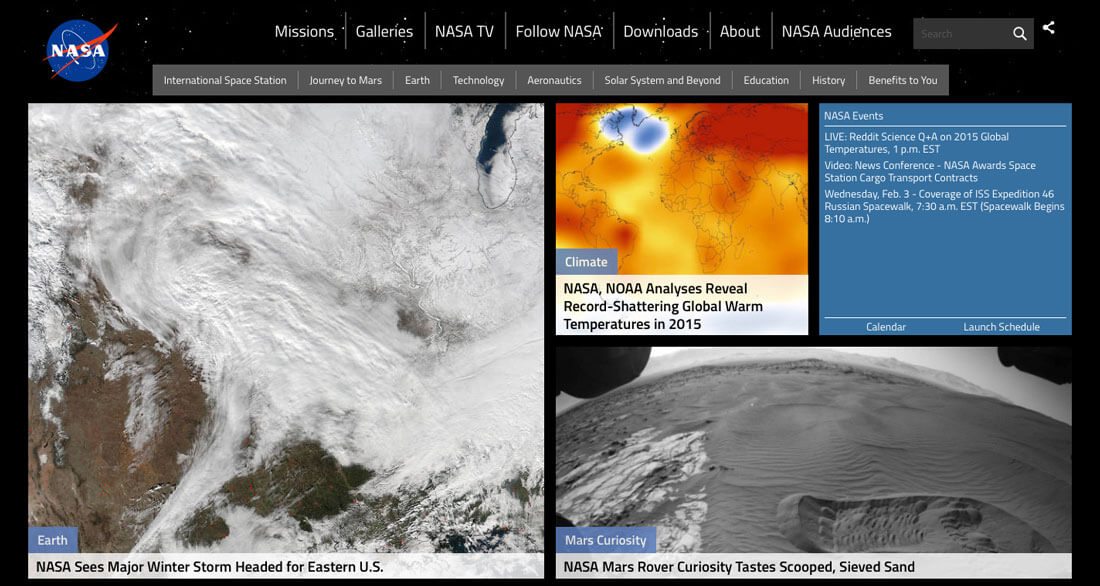
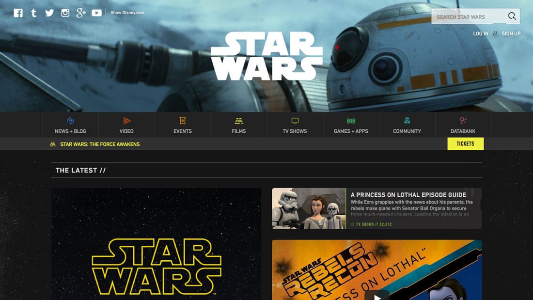
The same is true in design as well. These same elements are making their way into plenty of projects, some in the expected ways such as the iconic websites for NASA and Star Wars, but also in plenty of unexpected ways as well.
Spaced-based design is fun, interesting and often contains dark color schemes and white, or bright typography. Content specifically impacts how you can best use a space-based theme. Stay away from the common space associations unless you have related content. Otherwise, branch out a bit and use elements of space without the dark sky, stars and spaceships.
Try Constellation Outlines
You don’t need a space them to have fun with constellation-style outlines. Use interconnecting lines and dots to create a grid that draws the eye.
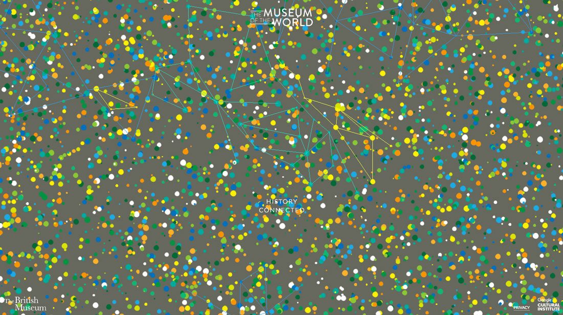
The British Museum does this masterfully. At first glance you might think the fun colors and lines (on top of star-like dots) indicate a space theme, but the surprise is that it is the start of a cool timeline.
The design is mesmerizing thanks to plenty of color and movement. What’s particularly nice is that the design renders quickly so users get to the main site and content without a prolonged wait. (The added bonus here is the render gives the site plenty of time to load in the background without feeling slow or weighty.)
Mix in Animation
To make dark themes more interesting, add in touches of animation to keep users engaged. Moving elements can add an extra layer to contrast to projects that don’t include a lot of color variance. (The most common color patterns with space design are dark, including black, purple or dark blue backgrounds. These designs often feature white contrasting elements such as type or button styles to draw users in.)
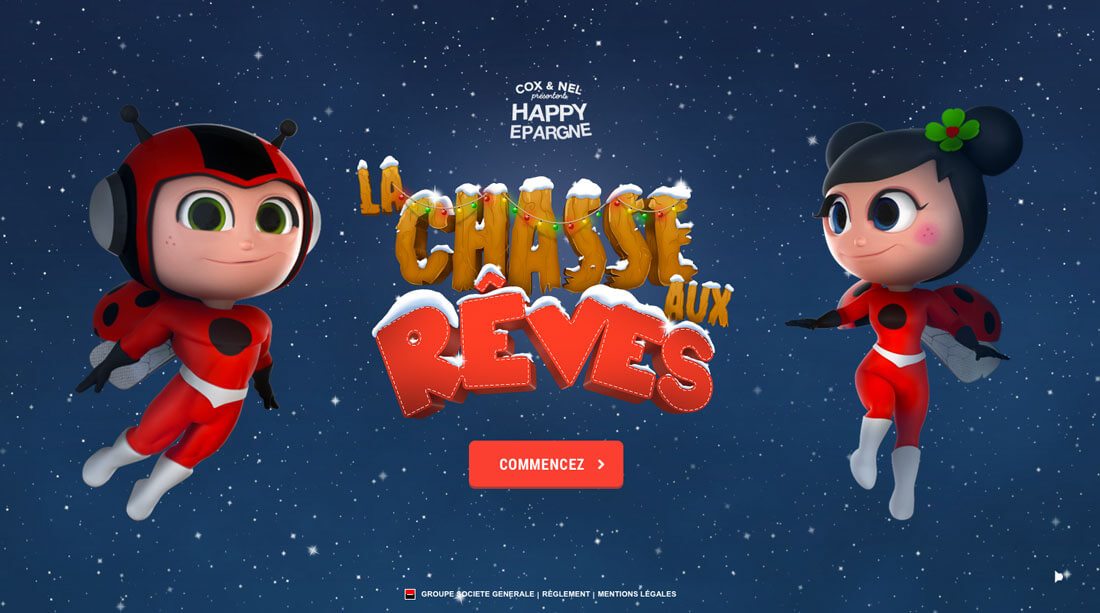
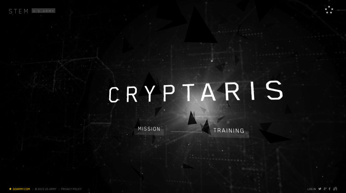
The examples above show two very different ways to incorporate space and animation. One site is a cartoon-based animated game, with oversized elements and distinct space imagery. (The characters are even dressed in full space suits, with helmets and seem to be floating in a gravity-less place.) The other looks a lot less out of this world, but includes a dark theme with light accents and fast-moving shapes to pull you in to a design that appears to move a light speed.
While both concepts are quite different, they use the space theme equally well. This shows just how versatile a space-based concept can be.
Play with Space-Age Imagery
Using space concepts in a design can be almost subliminal. Consider photos or shapes that evoke thoughts of space, but without actually using anything space-related.
You can accomplish this with color, shapes and the use of space. Browse through some of your favorite space images and take note of common themes to apply.
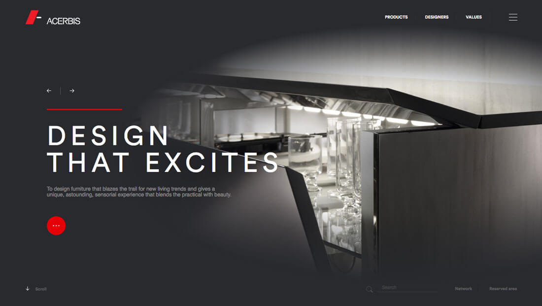
The main image for Acerbis Design is reminiscent of the Enterprise from Star Trek. The sliver of an opening in the stark silver scene gives you a glimpse of what’s inside. Other images across the site design use similar patterns.
What makes this work is the fun association with space, but no obvious space theme. Just that smallest touch of imagery that connects to a common space theme is enough. The design is fresh and modern and interesting. (That’s one of the nice things about a space aesthetic; it tends to feel new because of the implied aspect of possibility and the unknown.)
Just Go With It
Now that we’ve looked at plenty of ways to imply the use of space, there’s the obvious other solution: Just dive in and use a space theme. Play up a dark background or stars or implied three-dimensional landscape with plenty of depth.
The key for going “all in” is to make sure the design matches the content. (Using a space theme to sell wildflowers would probably seem pretty ridiculous.)
So how do you know if you can go with a full-on space style design? Start with connected word associations. Do any of the following words resonate with your content? (Because they are related to the space concept?)
Here are a few space words to think about:
Orbit, linear, solar, shuttle, galaxy, exploration, agency, universe, colony, media, station, solarium, technology, rocket, planet, curiosity, infinity, unknown, gravity, relativity, vastness and so on.
Orbit, linear, solar, shuttle, galaxy, exploration, agency, universe, colony, media, station, solarium, technology, rocket, planet, curiosity, infinity, unknown, gravity, relativity, vastness and so on.
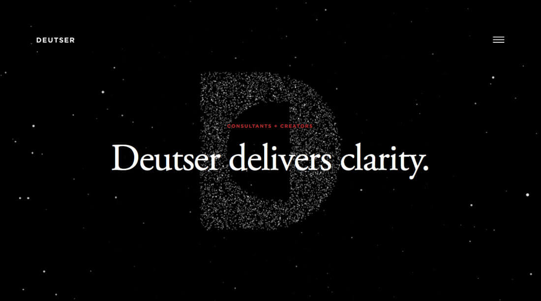
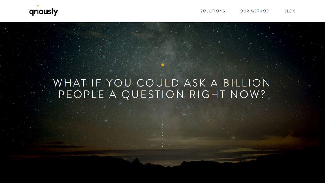
The space theme can actually work in more places and for more projects that you might initially think. The two examples above are pretty different site types – a business consulting firm and a data-based advertising group.
The use of space imagery is pretty different between the two as well. Deutser is more concept based with darkness and stars on the homepage only, with more people-based images throughout the scroll. The site for Qriously plays off the company name and a full-site space theme with a galaxy-style background on all the pages. Each design works and is visually interesting in a very different way.
Conclusion
Is your curiosity piqued? Are you thinking about space and how to apply it to one of your projects? It’s a rather trendy concept and will likely continue to be popular for a while.
It’s a solid concept in terms of design with an emphasis on space and minimalism with plenty of contrasting elements. Space is also one of those ideas that people just tend to be fascinated with and playing up that theme can help create just enough interest to draw readers or users into your design.

No comments:
Post a Comment